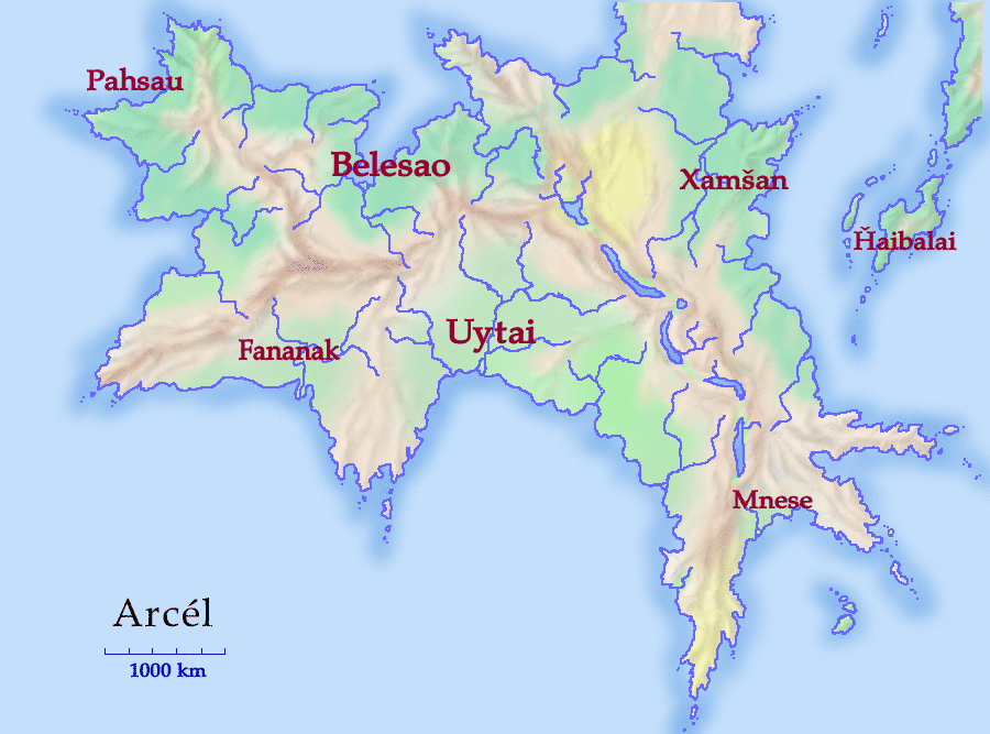
|
| ||||||
I drew this map in Adobe Photoshop Elements, a lower-end version of Photoshop that came free with my Wacom graphics tablet. It was entirely drawn on the computer, no scanning involved.
Like that guy in The Graduate, I have one word for you; and that word is layers. Layers are one of those brilliant ideas that you never knew you needed, but which become indispensible when you meet them. This map could be made without layers, but it was a lot easier and quicker with them.
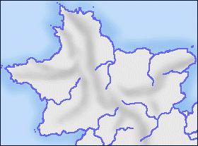
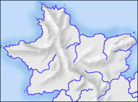
 At right is a schematic of how that map was constructed. Each layer is an independent drawing region, and parts of each are transparent. Layers can be moved around, duplicated, even temporarily hidden.
The first level to be drawn was, naturally enough, the coasts and rivers, the middle level in the finished map.
To form the top level, the ocean, I filled in the ocean and lakes with the paint can, then used the magic wand to select the drawn area. I cut the area (all the light blue) and pasted it into a new layer. I added the darker blue shadow with the airbrush (while the sea area was still selected, so the airbrush wouldn't color anything inside the continent).
I then created the terrain layer (I'll describe this in more detail below), placing it under the coasts-and-rivers so the terrain doesn't obscure the waterways.
The terrain level is done in shades of gray only. Instead of coloring it directly, I created a terrain color layer, set to 33% opacity. Then I could draw the terrain colors as solid blocks, and the terrain would show through. I purposely used rather light colors; darker colors make it hard to read superimposed text.
Finally, the text was placed on top. The diagram simplifies the actual construction, since each text area actually gets its own layer in Photoshop.
What you're seeing is really not my Photoshop image (believe me, it looks even better with millions of colors), but a GIF image created with Photoshop's Save to Web option. It has a pretty good dithering algorithm, so the maps use only 128 colors. (Without dithering, the shading breaks down into noticeable bands.)
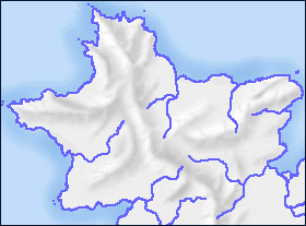
 Layers can help with special effects, like the transparent wash for the terrain colors; but the real beauty part is that they make the map adaptable. For instance, the map at left is another version of the same map file, showing political borders. It contains two new layers, one for the borders and one for the country colors, and it suppresses the terrain color layer. Separable layers can easily be combined into new maps.
Another neat use of layers is for sketching. I used to use the Clone feature in Painter Classic for this. That was like a single extra drawing layer: it allowed me to sketch out an image, then, with the sketch visible, redraw it as a nice final image. With layers, however, you can create a new sketching layer at any time, at any vertical depth within the image. You sketch away and experiment, and do the final work on yet another layer. In this map, I used this technique to outline the mountain ranges before drawing them.
I've plugged the graphics tablet before, and if you don't mind I'll do it again. It's the only thing that allows me to do things like this entirely on the computer. I used to convince myself that I could draw with a mouse; when I got the tablet I remembered that I couldn't. I can draw a lot better with my fingers than with my whole hand; and the pressure sensitivity is indispensible.
You can draw by hand and use a scanner, of course. If you have neither, however, I recommend putting off buying the scanner and buying a tablet instead, for the same price (currently about $100).
I have to emphasize that I'm not a geologist; so what I'm aiming at is mountains that will fool myself (and hopefully most non-geologist readers).
Always draw at magnification-- I used anything from 200% to 600%. You have a lot more control over your lines that way. (But frequently go back to 100% to see how it looks.)
| First, I used the airbrush tool (17-pixel width), in a gray a few shades darker than the neutral background, to draw the shaded sides of the mountains. Note that the mountains are basically parallel sets of long ridges, not the individual triangles you remember from Tolkien's maps.
Remember that you're drawing half of the mountain at this point, the shaded part. Which side is shaded? Pick a direction for the light (mine is the northwest) and be consistent. It may help to use a sketching layer to draw the continental divide-- the highest points of the mountains. Shade the side of the mountains away from the light. Don't overdo it... note that the river valleys are left flat. You can draw some low relief here in very light colors, but there's no real need. |
| Now I used a white airbrush to draw the other side of the mountains. Again, remember where the light is coming from.
I've also gone back and added some smaller ridges (for instance, the spur that divides the two river basins that drain into the northern ocean). For this whole process, by the way, I'm working with the terrain area selected. (The magic wand is useful for this.) That way I don't have to worry about drawing outside the continental area. (I don't draw over the rivers because they're on a separate layer.) |
| Now that the shading is more or less in the right place, I switched to a smaller airbrush (size 5 or 7) in a darker color, and sharpened up the top of the mountain ridges. I want the top ridge to be fairly sharp, but the bottoms to be fuzzy.
I've also taken the opportunity to make the ridges a little more random. Natural boundaries (coastlines, rivers, mountain ridges) are fractal, with plenty of detail at all levels. In the northern peninsula, among other areas, I've made the minor ranges meet up with the main range, instead of running parallel to it. It looks nicer that way. |
| The mountains in step 3 don't look that bad, and indeed if you use color overlays this is about all you'll see anyway. But to add some final detail, I used a smaller airbrush yet (3 pixels) and drew cross-shading: white lines on the shaded areas, dark lines on the bright areas.
Remember, Undo is your friend. Don't be afraid to draw some stuff just to see how it looks. If it doesn't look like you want it to, undo and try again. |
| At this point I decided that the mountains were a little too dark and sharp-looking. So I used the blur tool to soften up the edges, and also applied a lightening filter. Now the mountains don't overwhelm the map. |
|
| ||||||