|
| ||||||
Some folks have written asking how I created the maps and pictures in Virtual Verduria. Here's the main tricks.
 "Good" in this case basically means that it does anti-aliasing and 16-bit color. So, PC Paintbrush is out. I use Expert Color Paint, which was so cheap ($29) and full-featured that it's probably gone out of business. But any modern paint program will probably do the trick.o
(This just in: it is still available, but under the name Color It! (Their exclamation point, not mine.))
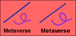
Anti-aliasing refers to using gradations of color to eliminate the "jaggies" due to low resolution. Compare the pretty anti-aliased lines and text in the left of the illustration to the evil ones on the right, which are non-anti-aliased (would that be just "aliased"?).
I use Fontographer on the Macintosh. It's a bit of an investment-- list price is $300-- and the version I have is buggy as hell, but it does the job.
It's usually easier to draw the original off-line, and scan it in. If you don't have a scanner... well, buy one, man, they're only a hundred bucks! A Kinko's or other copying place will let you use theirs at an exorbitant hourly rate. For awhile I even used that laborious but low-tech method you might have used in grade school: overlay the drawing with a sheet of acetate with a grid, and copy the contents of each square to the computer drawing.
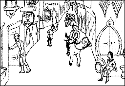
The Verdurian street scene, once scanned, looked like this.
The first step, then, is to blow it up 300%.
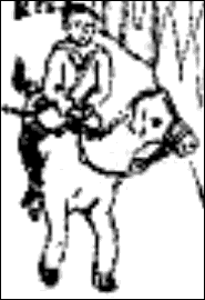
Now you fill in the details. It doesn't have to be perfect. The whole point is that it's going to look lots better when it's shrunk again.
You draw with big thick lines-- at least 3 pixels wide in this case. Remember that any details less than this size will be lost on reduction anyway.

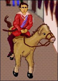
When it's done, you reduce it to 33%.
I used an old animator's trick in the drawings above: the outlines are in dark colors, not black. Black would make the drawing look cartoony, and would lose detail.
The shading was done with an airbrush tool set to the same color as the outlines.
Don't overdo it. Many a beginning artist tries to cover up bad drawing with excessive detail-- cross-hatching, thickened or additional lines-- and it ends up a mess.
If you're doing a map, add the lettering last, after reduction to the final size. Lettering doesn't tolerate expansion and compression very well.
Save a copy of the map before you add the lettering, both in case you really mess things up, and so you have an unlettered version of the map you can use for other purposes-- historical maps, dialect divisions, etc.
 Yeah, it costs money-- about $100. So don't buy the next six CDs
you had your eye on.
Yeah, it costs money-- about $100. So don't buy the next six CDs
you had your eye on.
Most of the graphics on my site were done the old-fashioned way, with mice. (And by cracky, working that way is good for you! Why, in my day, the browser fetched packets by mule train! And you had to animate the GIFs by turning a crank!)
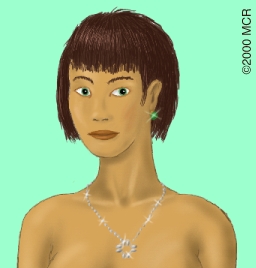
But now I have a Wacom tablet, and what was laborious has become a pleasure. In fact, you can actually draw using a tablet, as opposed to touching up things drawn offline and scanned in. The tablet gives you the fine control needed for drawing; and a good paint program gives you back a feature you may not have realized you were cheated of: the ability to vary the thickness of a line by applying greater or lesser pressure.
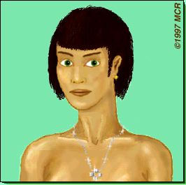
The picture on the left was done with the mouse; the one on the right, with the tablet.
 Insane patience, plus common sense.
First, draw the overall line of the mountains-- the continental divides. Don't draw the mountains yet.
Now draw the rivers. Rivers, you know, come out of mountains (or at least high areas) and end up in the sea. Create networks of rivers: an entire plain may be watered by a single water system.
If you like fjords, like Slartibartfast, remember that they are simply drowned river valleys. Draw the network of submerged rivers and draw a contour line above them; that's your coastline.
Now you can draw the mountains. There's many ways to do this; look at a few atlases to see one you like (and which isn't beyond your drawing skills). Mountain ranges tend to consist of irregular parallel ridges-- not isolated pyramids. Obviously, the rivers form your valleys, and have to come out of the mountain tops, and the mountains never cross a river! Mountains are highest at the continental divide and fade off into foothills farther away from it. Leave some passes (low spots between peaks) so the barbarians can invade.
Drawing just the shaded side should suffice-- the other side of the mountain can be indicated by the map's background color. Remember what direction the light is coming from! If you want to be fancy, leave some little white lines to break up the shaded part, and some shaded lines on the other side.
Don't use dark colors for either mountains or rivers-- you won't be able to see lettering on top of them.
The terrain colors on my maps were added after the mountains. The mountains were drawn in grey; then a wash of transparent color was added on top of them. That good paint program you got in step 1 should know how to do this.
A good basic drawing book is Jack Hamm's Drawing the Head & Figure. It contains plenty of methodical tips for the beginning artist, and plenty of interest to the more experienced artist.
There are many beautiful maps, but few that are more effective or fascinating than those of Colin McEvedy's Penguin historical atlases. Instead of showing various ancient empires at their heights, he shows an entire continent at intervals of a century or so. Nothing gives a better sense of the outlines of history, and the ebb and flow of nations.
If you want to draw costumes, alien creatures, buildings, coins, etc., but don't have a great visual imagination-- and I don't-- then you're likely to create images of astonishing banality, unless you jump-start your visual creativity with good models. Some movies are good for this (notably Blade Runner, Brazil, and The Fifth Element), but they're not exactly in a format you can sit in front of and study.
So, read European comics instead. Try Moebius, Enki Bilal, Schuiten & Peeters, Joost Swarte, François Bourgeon, Mézières (of Valérian). Among U.S. artists try Jim Woodring, Dave Cooper (Suckle), Winsor McCay (Little Nemo), and George Herriman (Krazy Kat).
|
| ||||||