The future of ABC
What will typography look like in 400 years? Or, for the Incatena, nearly 3000 years?
Most designers simply look for the minimally recognizable letterforms. So they come up with this:
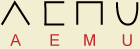
And if that's 400 years of evolution, presumably 3000 looks like this:
This is reasonable if you consider Fraktur > Uncial > Times Roman > Helvetica to be the inexorable movement of history.
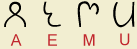
Things do simplify. But equally, things get more complex. Look at what happened to the letter ṅa from Brahmī to Gujarati, over 2000 years:

Where do the complications come from? Well, the Indian case suggests that they derive from the artefacts of simplification! The first step above replaced three strokes with two. The next reduced it to one connected line. This produced a nose-like shape in the middle that was taken as part of the letter’s prototype. It was emphasized, then simplified to a spike. Then the top line was removed, leaving three pieces behind.
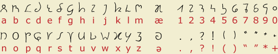
I tried to apply these principles to the Hanying alphabet. E.g.:
The general principle is that each letter came to be written as a single stroke. But this created artefacts which became part of the prototype, and could be developed further but not omitted: the twist in the A, the middle peak of the E, the long handle of the M, the right bar of the U. What would be lawful variants of these letters for us, as in the first graphic above, would not be understood in the Incatena era, any more than the Brahmī I would be read as a proper ṅa by a Gujarati.
In addition, I tried to make sure that no symbols had the same form (there’s no longer confusion between 1/l or 0/O or 2/Z, and no common symbols are mirror images of each other (e.g. b d or p q).
The alphabet
The base symbols of the Hanying alphabet:
To be precise, this is the descendant of the Roman alphabet used on Mars for Hanying, Mars Swahili, and Portunhol. (Marindi uses its own abugida, descended from Devanāgarī.)
As such, the values of the letters in Hanying are a little different:
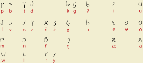
- The letters descended from x z represent š ž.
- Because of this, Hanying z needed a new letter; it’s formed from t because it historically derives from HC t.
- The glottal stop is a diacritic on h, because (written) ʔ derives from intervocalic h.
- ɣ adds a diacritic to g, for similar historical reasons.
- There is no ñ anymore, but it’s written where it used to occur.
- Letters C J Q are not used for writing Hanying; they can be used for other languages or for mathematics.
There are capital letters too. For the most part these are just taller versions of the minuscules, but D H R do look a little different.
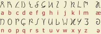
Related alphabets
On Earth, there is no single Roman alphabet, but three, which we can roughly call American, European, and Douanier. The latter, which is not too far from Hanying, is used in the southern hemisphere. The descendants of English use all three: the 'American' system is also used in Canada and England, but Ireland and Scotland use European, and Australia/NZ/South Africa/India use Douanier. Luna is a similar mess.
See also Cyroman, the alphabet used in the α Centauri system. A few Hanying letters are influenced by Cyroman: D R v.
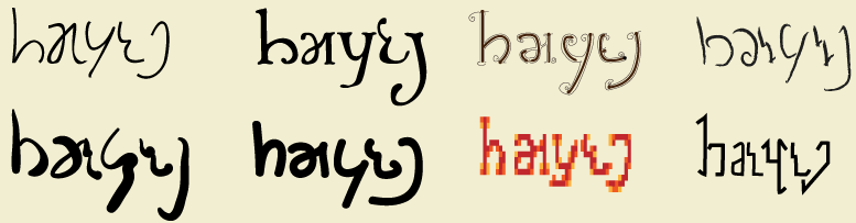
Font variation
The letterforms shown above should be understood as prototypes. Actual typography is just as diverse or more so than in our own time. For instance, here are some examples of the word hæyeŋ ‘Hanying’:
The 39C reform and its discontents
As noted in the grammar, the Hanying writing system represents the language from a thousand years ago. Because of long lives, language changes slowly, but a few sound changes have accumulated. The lexicon gives the current (spoken) form, but the written form is easily found if you also look at the Hanying Creole etymon:
- If the HC has a vowel e where MH has i, before a syllable with i, write ü
- Likewise HC o / MH e: write ö
- Restore intervocalic v
- If the HC has ñ, write that in place of y
- Final ə is written a
- Final ʔ is written k
As noted in the grammar, stress accent is not marked.
The word hæyeŋ derives from HC Hañiŋ, so you might expect it to be written *hæñeŋ. But the word was reanalyzed based on other hæ- words referring to 'China', so it not have an ñ at the time of the reform.
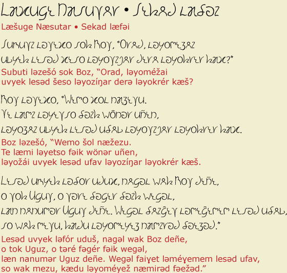
Example
Here's the Diamond Sutra sample text written in the Hanying alphabet. The transliteration follows the written text, using the conventions
described in the last section; compare to the spoken version in the grammar.
The font
The font used to create this page is available here.
For convenience, you can type $ for ŋ, % for ɣ, & for Ɣ, @ for ə.
(These punctuation characters are not used as such in 4901.)
Mac users can use opt=' for æ and opt-? for ʔ.
To properly write Hanying, note that the letters X Z C are used for what I've transliterated as Š Ž Č. But Hanying has developed a new /z/ sound. Mac users can type opt-z (Ω) for z and opt-Z (¸) for Z.
The font should be reasonably complete for European languages. That is, it contains most of the Latin-1 code page, at least.
Back to the Modern Hanying grammar
Back to the Incatena page